Matilde Peixoto


I conducted in person interviews with children between ages 4 to 10 and their parents, on issues surrounding emotions and the ability to feel empathy. Many kids admitted struggling to understand and express complex emotions, often feeling overwhelmed or guilty when unable to manage them. Parents echoed these concerns, highlighting the importance of teaching children emotional expression, empathy, and social skills through repeated, engaging activities. The personas summarize my research findings from these interviews, scroll through to see the second persona.


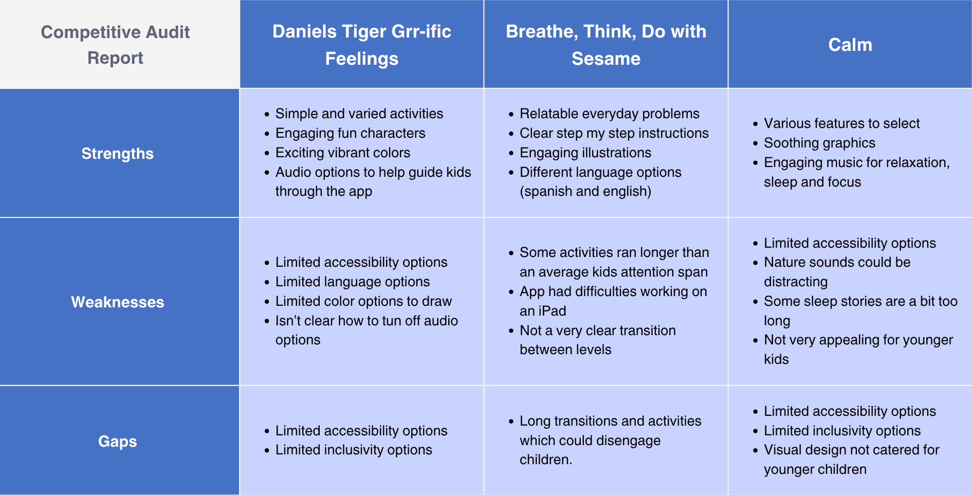
The audit below analyzes several competitor products, highlighting their strengths and weaknesses. These insights are valuable for identifying gaps and opportunities that Max’s Adventure app can address.
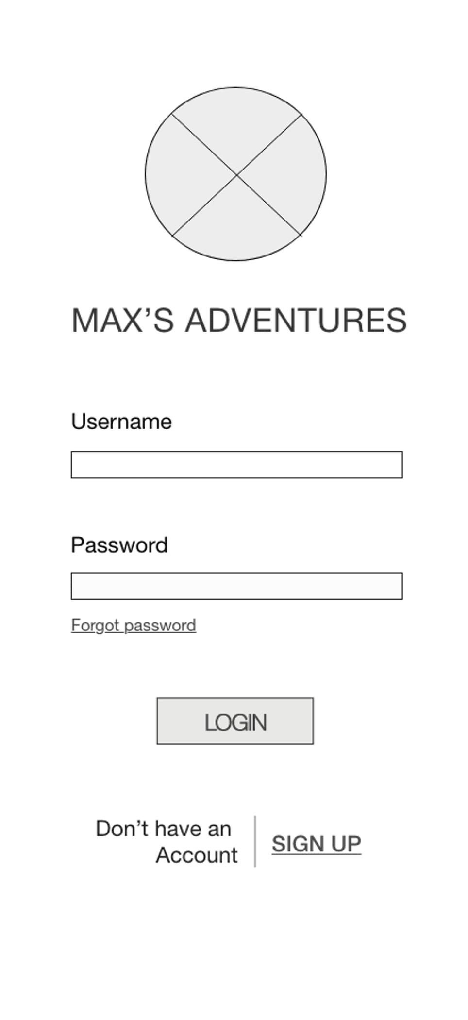
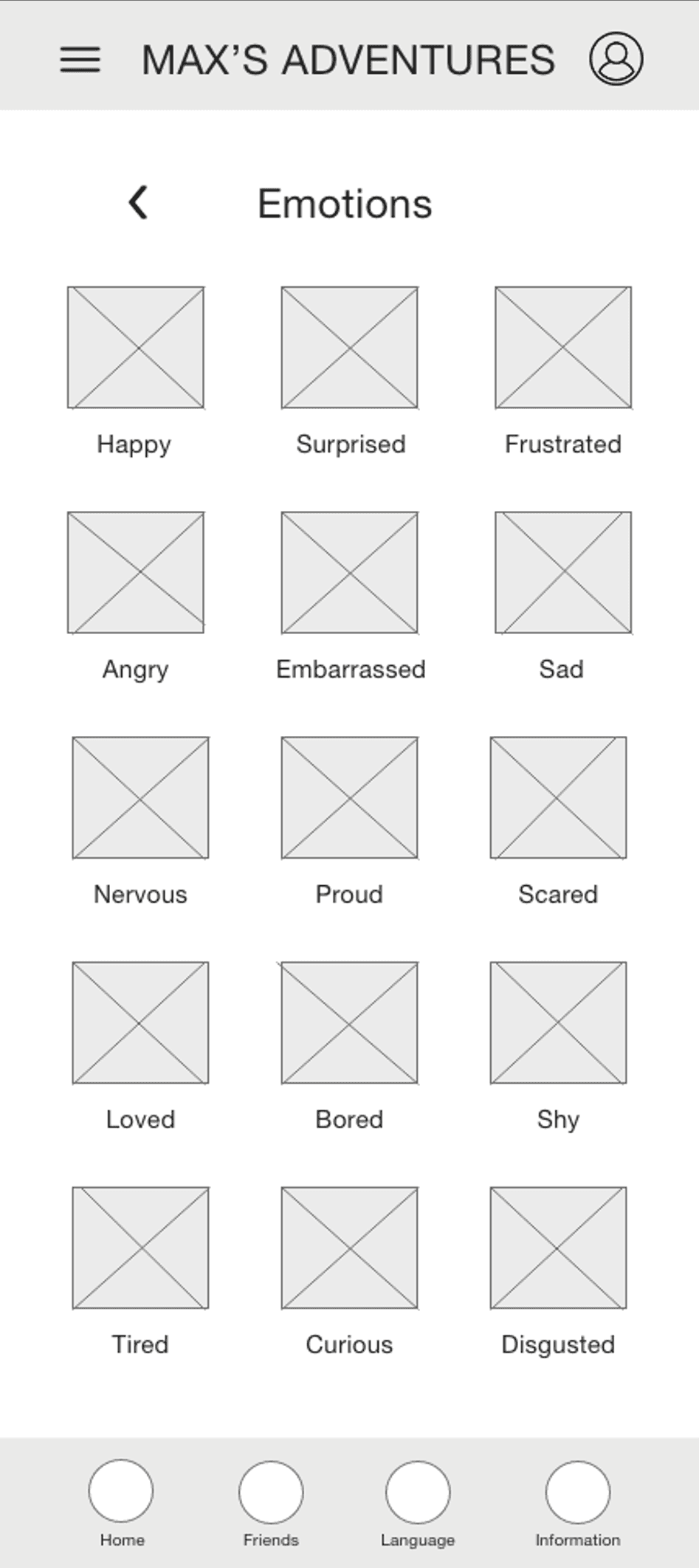
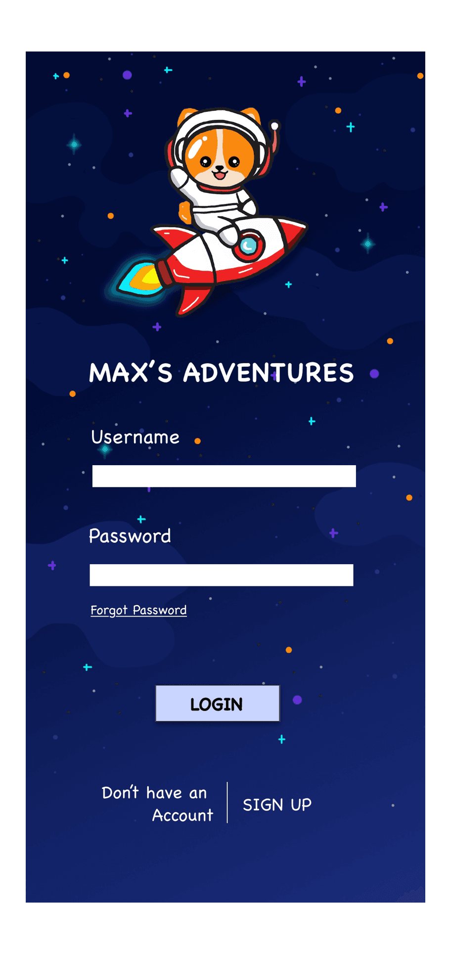
After drafting paper wireframes, I created the initial digital designs for Max’s Adventure app. These designs focused on teaching kids about the different kinds of emotions, and then providing various activities for the kids to channel and deal with these emotions.
To prepare for usability studies I also created a low fidelity prototype. Low Fidelity Prototype Link

I conducted an unmoderated usability study with five participants, both in Washington D.C. and remotely, each session lasting 20 to 30 minutes. Three key issues where identified: confusion over the emotion learning feature’s integration, unclear wording, and navigation challenges.
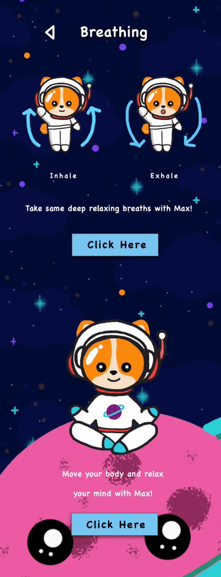
Based on the insights from the usability studies, I applied design changes to my high-fidelity wireframes. An example of one of these changes is when I added “click here” buttons on the physical activities page to indicate how to navigate to the breathing and yoga pages. This improves the app's navigation by increasing its intuitiveness and accessibility.
The high-fidelity prototype followed the same user flow as the low-fidelity prototype, including design changes made after the usability study. High Fidelity Prototype Link

Conduct research to evaluate how successfully the app teaches kids about emotion and empathy, provide incentives to encourage their learning, and run a usability study to confirm whether the high-fidelity prototype resolves user pain points.
In designing my children’s app, I focused on accessibility by: ensuring strong contrast between foreground and background for easy text readability; adding headings with varying text sizes to create a clear visual hierarchy; and buttons are distinctly labeled, colored, and highlighted to stand out, making navigation intuitive and features easy to identify.
The younger users (ages 4 – 10) shared that they really liked Max (the corgi in a spacesuit) as he was “fun and cute”. They enjoyed the variety of different activities provided and the lively colors and images. The parents also liked the fact that there were a lot of different emotions provided for the kids to learn from.